KAIA
BEAUTY PACKAGING LANGUAGE
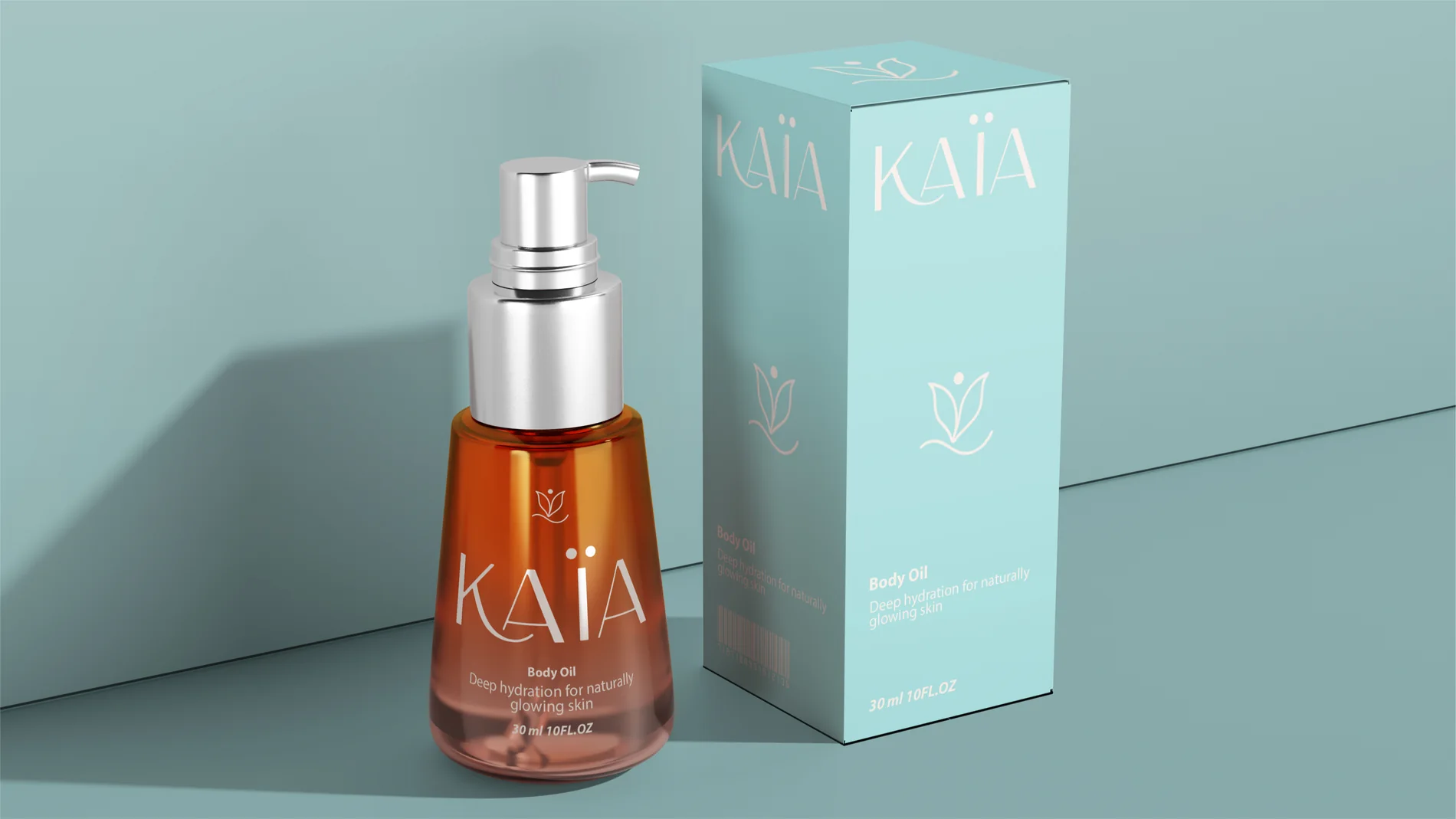
A beauty logo and packaging language for KAIA, a clean skincare brand, built on softness, clarity and calm. One system carries the whole range, from serums and creams to jars, cartons and shopping bags.
SOFT, CLEAR
AND CALM
KAIA needed a beauty identity that felt calm and premium without shouting. Every pack had to be understood at a glance and stay consistent as the range grows.
We drew the KAÏA wordmark with a small flower mark, then set a soft teal-and-white palette with generous white space. One clear hierarchy (brand, product, benefit) repeats on every pack, so new products drop into the system instead of being designed from zero.
The range covers serums, creams, lotions, cleansers, a scrub, a mask, oils, a mist, jars, cartons and shopping bags, plus campaign imagery and a CGI packaging film.
Related work: Alura Packaging · Pure Dose · Heart of Matcha · Beauty packaging design
PROJECT
VISUALS
Multiple touchpoints from the project are shown together so the system feels real, not like a single isolated mockup.