
Trend lists are easy. Knowing which trends convert is the hard part. Every year packaging blogs publish the same roundups, and every year brands adopt styles that photograph beautifully and sell nothing. Here are the 2026 trends we actually see performing on shelves - filtered through one question: does it move product?
1. Bold simplicity (because shelves got louder)
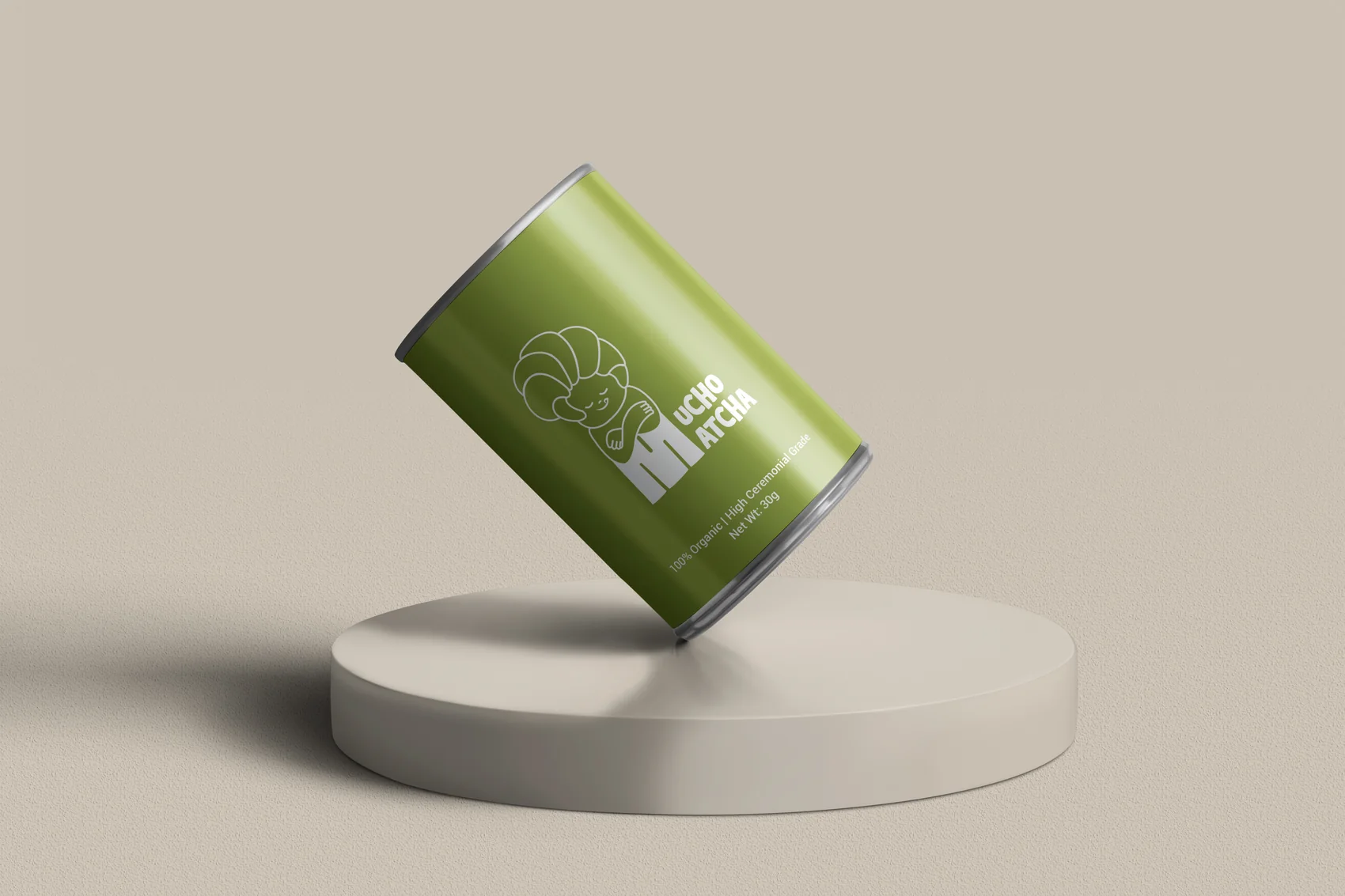
As competitors add more, the brands that remove win. One dominant colour, one oversized word or mark, generous space - designs that read in half a second from two metres. This is not minimalism for taste; it is a response to visual noise. The busier the category, the harder simplicity works.
2. Honest sustainability (greenwashing is dead)
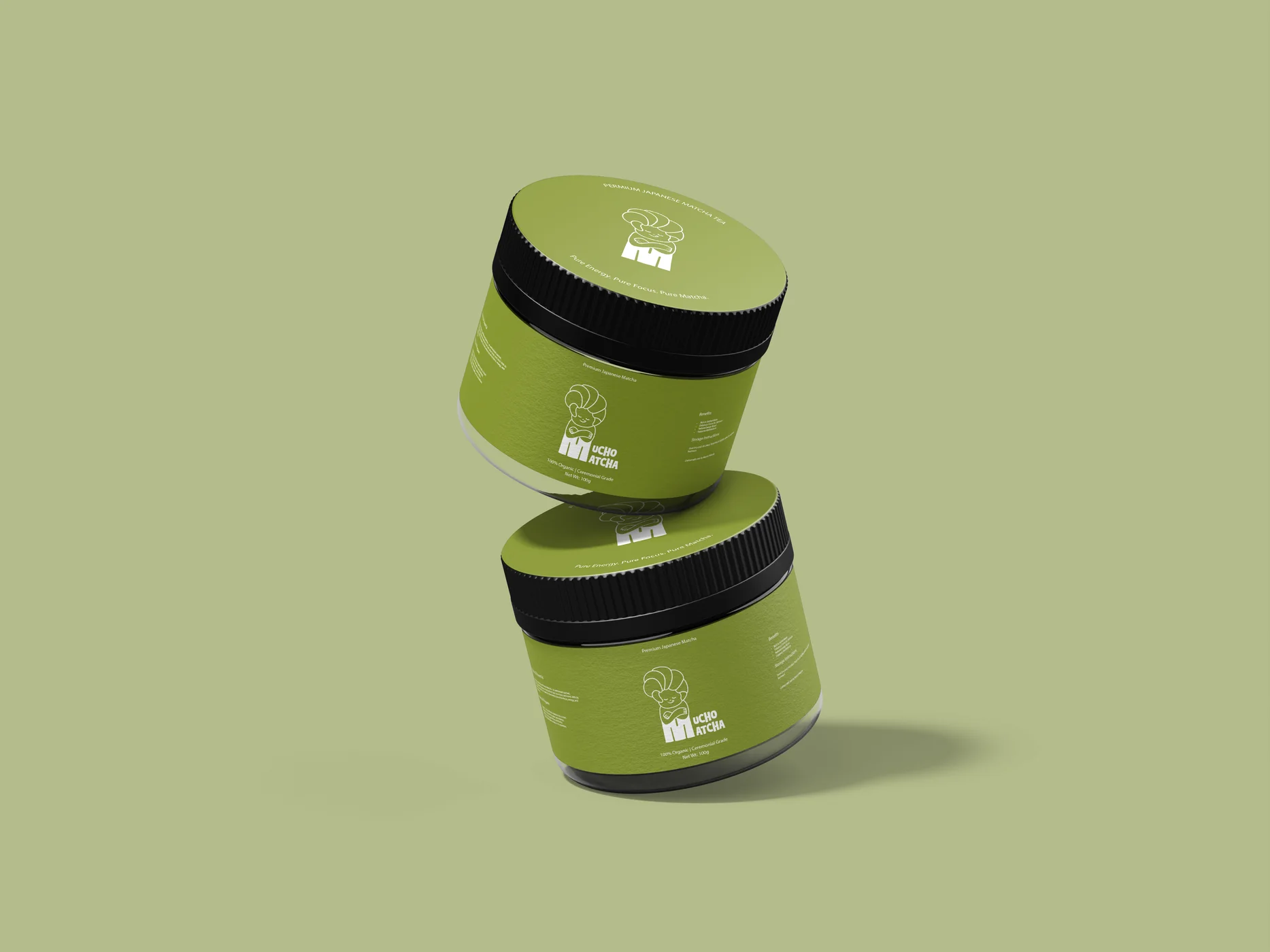
Beige kraft paper with a leaf icon no longer convinces anyone. In 2026 the trend is material honesty: mono-materials that are genuinely recyclable, refill systems, printed claims that are specific ("this tub is 100% rPET") instead of vague ("eco-friendly"). Customers reward brands that prove it and punish brands that perform it.
3. Typography as the hero
Custom and expressive type is carrying more brands than photography this year - wordmarks that stretch across the whole pack, menus of type weights instead of decoration. It is distinctive, it scales across SKUs cheaply, and it survives every size from thumbnail to billboard.
4. Tactile finishes that reward the pickup
Shelf presence gets the pickup; texture closes the sale. Soft-touch coatings, embossing, exposed uncoated stock - finishes are doing the premium signalling that foil used to do, more quietly. In e-commerce this translates to unboxing: the inside of the box is now a marketing surface. Our Home of Coffee work leans on exactly this warmth.
5. Phygital packs
QR codes finally grew up: brewing guides, provenance stories, loyalty, refill ordering - the pack has become a doorway rather than a dead end. The trend that sells is useful content behind the code; the one that doesn't is a QR linking to your homepage.
A trend is worth adopting only if it makes your brand more like itself - not more like this season.
How to use trends without being used by them
Filter every trend through positioning: does bold simplicity fit a heritage brand? Does phygital serve a customer who just wants shampoo? Adopt what amplifies your strategy, skip the rest - that is the difference between a brand and a mood board. For category-specific guidance, read our complete F&B packaging guide, browse Pure Dose and Mucho Matcha to see trends applied with intent, or ask us what fits your brand.
Frequently asked questions
What are the biggest packaging design trends in 2026?
The trends actually moving product in 2026: bold simplicity that reads at a distance, honest sustainability (materials that are recyclable, not just beige), expressive typography as the hero, tactile finishes that reward pickup, and phygital packaging - QR-linked content that extends the pack experience.
Should my brand follow packaging trends?
Follow a trend only when it serves your positioning. Trends are tools, not strategies - a trend that fits your audience sharpens the brand; a trend adopted for its own sake makes you look like everyone else the same season.
What packaging trends should brands avoid?
Avoid greenwashing aesthetics without real material change, cluttered maximalism that dies at shelf distance, and any style so tied to this season that it dates the moment the trend cycle turns.