
Food and beverage is the hardest category in packaging design - and the most rewarding. Nowhere else does a customer make a faster decision, with more competing options, driven by something as primal as appetite. This guide covers what actually matters when designing F&B packaging, drawn from our own work across food retail, snacks, coffee and beverages.
1. Appetite appeal comes first
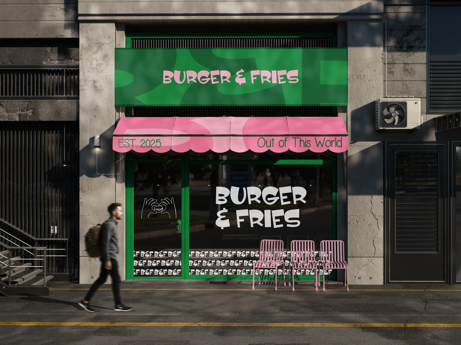
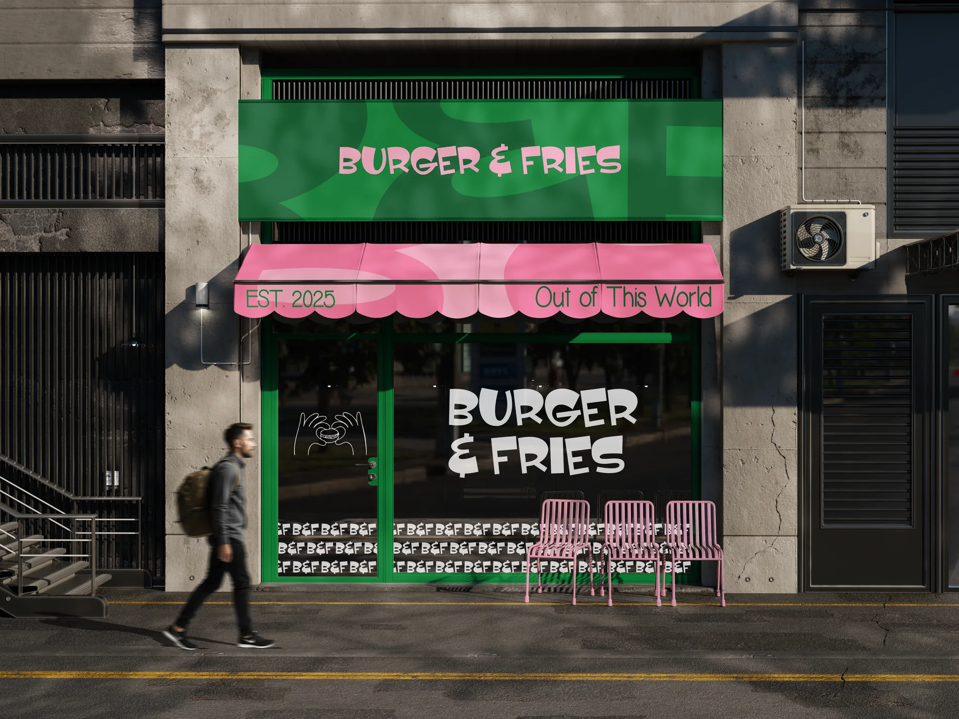
Before a customer reads a single word, the packaging has already told them how the product tastes. Colour temperature, texture, photography or illustration style - all of it signals flavour. Warm tones suggest indulgence; clean palettes suggest freshness; bold graphic systems suggest fun. The design language has to match the eating experience, or the shelf promise breaks at first bite. Our Burger & Fries identity is built exactly on this: appetite first, everywhere the brand shows up.
2. Shelf presence is a distance game
Most packaging is designed at 100% zoom on a laptop and first seen at three metres in a store. Test your design small and far away: does the brand read? Does it separate from neighbours? One strong shape or colour block beats five clever details nobody sees. Distinctiveness at a distance, detail up close - in that order.
3. Design the range, not the pack
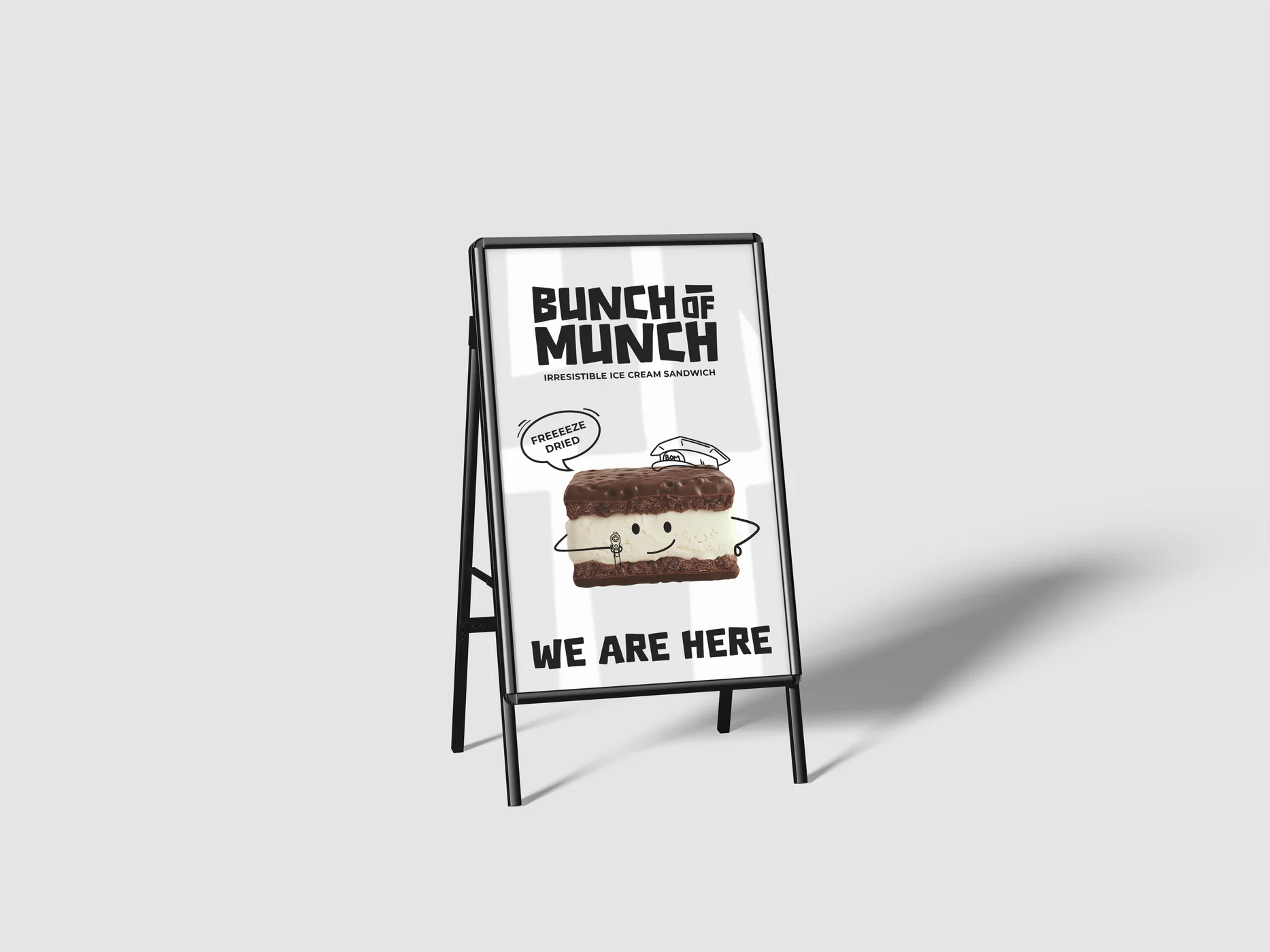
F&B brands rarely stay one product. Flavours, sizes and seasonal editions arrive fast, and packaging designed as a one-off collapses at the second SKU. A proper system defines what stays fixed (logo placement, structure, brand colour) and what flexes (flavour cues, imagery) - so the range grows without redesigning from scratch. Our Bunch of Munch packaging shows a snack system built to flex this way.
4. Compliance is part of the design, not an afterthought
Ingredients, nutrition panels, weights, barcodes, certification marks - F&B carries more mandatory content than any other category. Amateur packaging treats these as clutter to squeeze in at the end; professional packaging designs the information hierarchy around them from day one, so legal content feels intentional instead of taped on.
5. Materials talk
Kraft suggests craft and honesty. Foil suggests indulgence. Matte suggests premium restraint. Uncoated stock suggests natural and organic. The material and finish are part of the message - and they also decide how the pack survives grease, heat, refrigeration and delivery. Choose them with the same care as the colour palette. For coffee especially, where warmth and ritual matter, material does half the talking - see our Simply Coffee identity.
In food and beverage, the packaging is the last ad the customer sees - and the first taste they imagine.
6. Budget for the system, not the artwork
Good F&B packaging is an investment in sell-through: it earns the pickup, justifies the price and keeps the range coherent as you grow. If you are planning numbers, our packaging pricing breakdown covers real ranges and what drives them.
Putting it together
Appetite appeal, distance-first shelf presence, a range system, compliance designed in, materials that match the message. Get those five right and the packaging stops being a cost and starts being your hardest-working salesperson. Explore more of our F&B and packaging projects in our work, or tell us what you are launching.
Frequently asked questions
What makes food packaging design different from other packaging?
Food packaging has to trigger appetite, communicate trust and freshness instantly, meet labelling and compliance requirements, and survive real-world conditions like heat, grease and refrigeration - all while standing out on a crowded shelf.
What is appetite appeal in packaging?
Appetite appeal is the ability of packaging to make the product feel delicious before it is tasted - through colour, texture, photography or illustration style, and material choices that suggest freshness and quality.
How much does food packaging design cost?
Single-product food packaging usually starts around $3k - $7k with an independent studio, while multi-SKU ranges and full brand-plus-packaging systems are typically $7k - $15k+ depending on scale.