
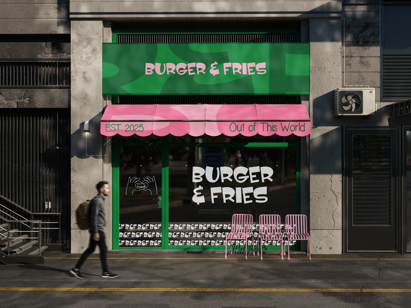
The imported look has a cause, and it is structural. A pack is designed in English on a left-to-right grid, approved, and then handed to someone to "do the Arabic". The Arabic is set in whatever typeface ships with the software, at whatever size fits the leftover space, usually under the English. The result is legally compliant and visibly secondary, and every Gulf shopper reads it that way. The fix is not a better Arabic font. It is designing both languages on one grid from the first sketch.
What is a bilingual grid?
A grid that is drawn to hold two reading directions at once. In practice it has four properties:
- Mirrored structure. The English reads left to right from the top-left anchor; the Arabic reads right to left from the top-right. On a front panel the two share a vertical axis and mirror around it, so neither language is pushed to the margin. On a back panel with a single information column, the column is built right-to-left first and the English follows the same rows.
- Matched visual weight, not matched point size. Arabic and Latin letterforms have different heights and densities. An Arabic face set at the same point size as its Latin partner usually looks smaller and lighter. The scale is matched by eye, on a printed proof, until the two names carry the same weight at three metres. The numbers in the style guide come after, not before.
- Two wordmarks, one system. The Arabic brand name is drawn as a wordmark with the same construction logic as the English: the same stroke contrast, the same terminals, the same rhythm. It is not the English logo with an Arabic line underneath. When the two sit side by side they read as one brand in two scripts.
- Shared hierarchy. If the flavour name is the second-largest element in English, it is the second-largest in Arabic. If the origin line is small caps in English, it has an equivalent treatment in Arabic. The hierarchy is one decision applied twice, never two decisions.
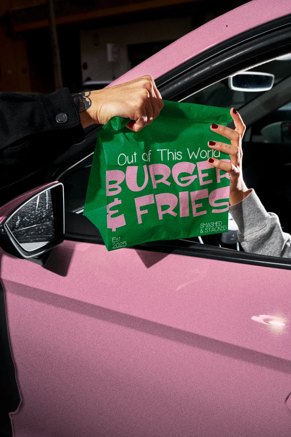
Where do bilingual packs usually break?
| Element | The translated pack | The bilingual pack |
|---|---|---|
| Brand name | English logo, Arabic set in a system font beneath | Arabic and English wordmarks drawn together, equal weight, side by side or stacked by rule |
| Product name | Arabic squeezed into leftover space | Both names on the same baseline grid, matched by visual size |
| Front hierarchy | English leads, Arabic follows | One hierarchy applied in both scripts; on a Saudi pack the Arabic leads |
| Information panel | English panel mirrored, Arabic added, often incomplete | Arabic-first panel built to GSO 9:2022; English follows the same rows |
| Numerals | Mixed Arabic-Indic and Western digits at random | One convention chosen and kept, usually Western digits across both scripts for weights and dates |
| Type pairing | Whatever Arabic face was installed | An Arabic face chosen to match the Latin's contrast and tone, tested on proof |
The information panel is a bilingual system too
Under GSO 9:2022 the label must be in Arabic, and any other language must match it. So the panel is not an English panel with Arabic added. It is an Arabic panel, complete, with the English set to the same structure: same rows, same order, same emphasis on allergens, same print zone for the dates. Designing it Arabic-first also solves the most common production failure, where the Arabic text runs longer than the English and overflows the space allotted to it at the last minute. Our SFDA layout checklist covers what the panel must contain.
Three tests before print
- The three-metre test. Print the front at size, stand across a room, and read the product name in Arabic, then in English. If one is legible and the other is not, the scale is not matched.
- The cover test. Cover the English with your hand. Does the pack still look finished, or does it look like something is missing? Now cover the Arabic. The answer should be the same both times.
- The thumbnail test. Photograph the front, shrink it to 150 pixels wide, and look at it on a phone. If the Arabic name has become a grey line, the app listing will fail before the shelf does.
Who sets the Arabic?
The buyer guides for Saudi and UAE brands tell them to ask this, and they are right. Bilingual grids are built by a designer who reads Arabic, sets it, and can tell when a ligature has broken or a kashida has been stretched to fill a gap. It is not a translation step and it cannot be outsourced to one. At LIRCLE the Arabic typography is set in-house by a designer who reads it, on the same grid and in the same file as the English. It is the first of the twelve questions we suggest asking any studio, including us.
See the grids in our bilingual packaging work, budget a system with the Saudi cost guide, and send us a pack that already exists in one language. We will show you what the other half needs.
Frequently asked questions
What is a bilingual grid in packaging design?
A layout grid drawn to hold Arabic and English at the same time: a mirrored structure for the two reading directions, a type scale matched by visual weight rather than point size, two wordmarks built with the same construction, and one hierarchy applied in both scripts.
Why does Arabic on packaging often look like an afterthought?
Because the pack was designed in English first and the Arabic was added afterwards in leftover space, usually in a default typeface at a point size that reads smaller. The fix is structural: design both languages on one grid from the first sketch, with the Arabic wordmark drawn as a brand mark.
Should Arabic or English lead on a Saudi pack?
Under GSO 9:2022 the label must be in Arabic and any other language must match it. On a Saudi shelf the Arabic name should lead and the English sit at equal visual weight. Both languages should look finished on their own.
How do I test whether a bilingual pack works?
Three tests: read both product names from three metres; cover each language in turn and check the pack still looks complete; and shrink the front to 150 pixels on a phone to see whether the Arabic name survives as a thumbnail.