BURGER & FRIES
RETAIL FOOD BRAND SYSTEM
A loud, simple identity for Burger & Fries, a quick-service burger brand, built for storefront impact and takeaway packaging people remember.
LOUD ON THE STREET,
CLEAR ON THE BOX
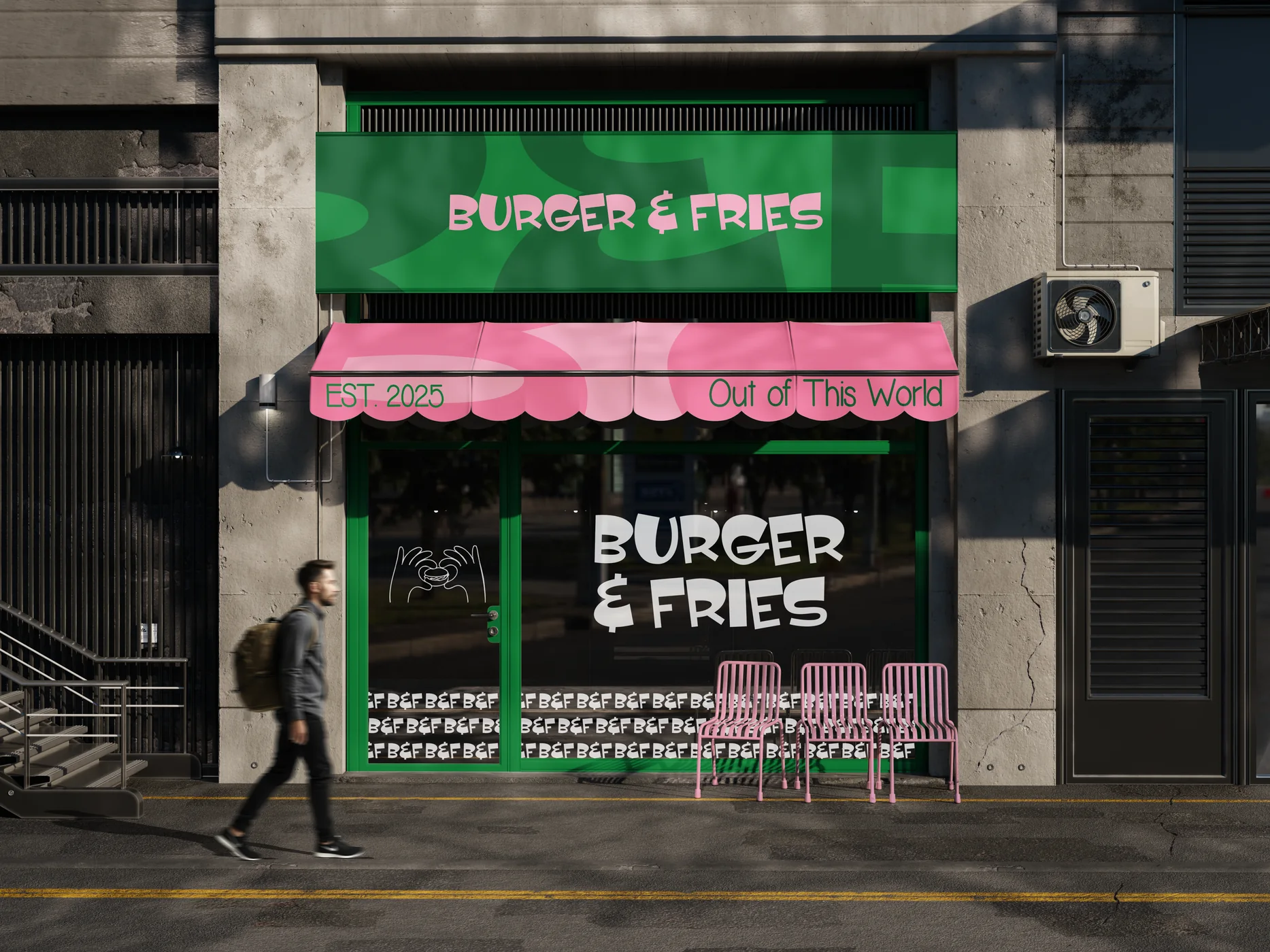
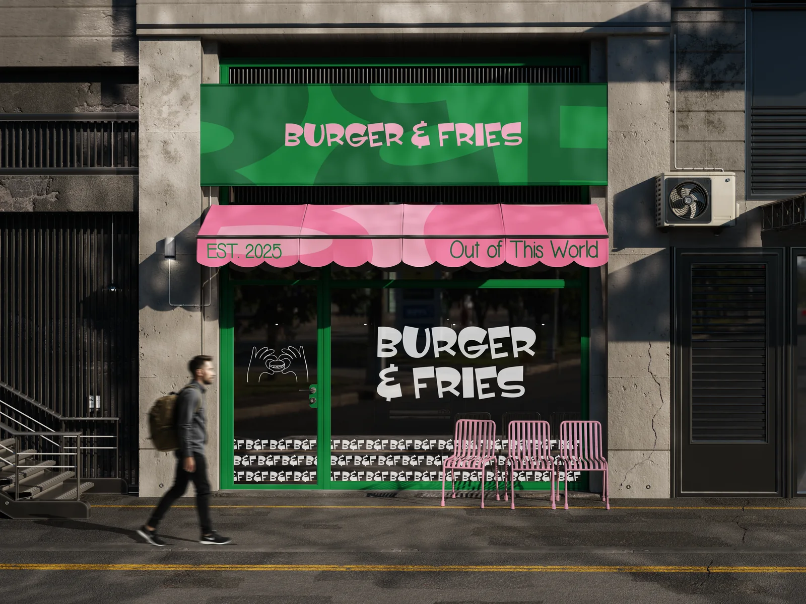
A burger brand competes on the street and in the delivery bag. Burger & Fries needed an identity loud enough for the storefront and simple enough to repeat on every box, bag and wrap.
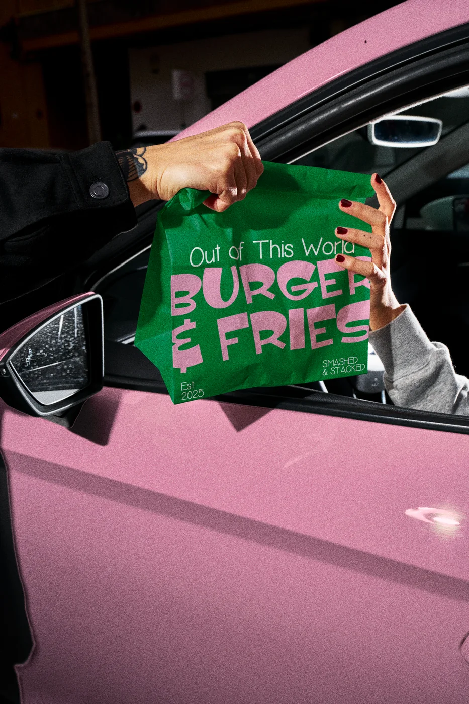
We built a wordmark and a B&F monogram around the line “Out of This World”. Heavy type and a tight colour set do the work: one red system plus a pink and orange second colourway. The mark holds at signage scale and still reads on a small wrap.
The packaging covers burger wrap, fries carton, takeaway bag, printed tape, sleeve, cup and tray, with storefront and awning direction, campaign key visuals and a CGI packaging film.
Related work: Bunch of Munch · Oolio · Bake Away · Food packaging design
PROJECT
VISUALS
Multiple touchpoints from the project are shown together so the system feels real, not like a single isolated mockup.