Good packaging does one job before it does anything else: it earns a second look. On a crowded shelf a customer decides in about a second whether to pick something up. Alura needed packaging that won that second - and then justified the price the moment it was in hand.
The brief: presence without noise
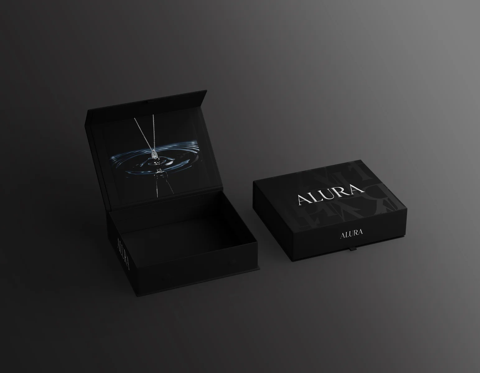
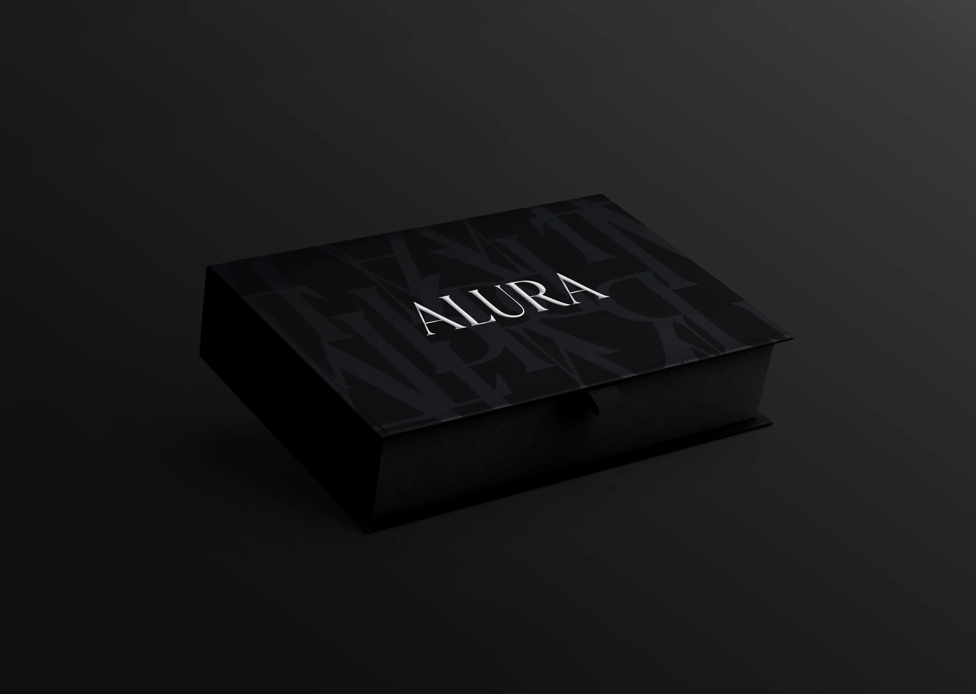
Luxury is easy to overdo. The temptation is to keep adding - more foil, more detail, more colour - until a product looks expensive but feels busy. Alura wanted the opposite: a system that read as premium through restraint. The goal was confidence, not decoration.
Where we started
Before any visuals, we mapped how the product would actually be seen: on a shelf beside competitors, in a hand, in a photo, in an unboxing. Each of those moments asks something different from the design, and a real system has to hold up in all of them - not just in a single hero mockup.
The principles we designed around
- Restraint over ornament. One strong idea, expressed cleanly, beats five competing ones.
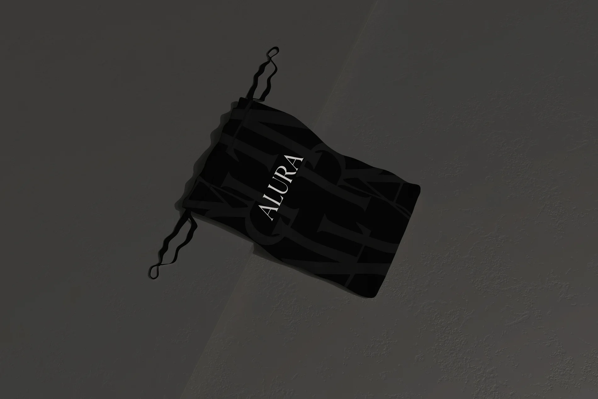
- Tactile before visual. Material, weight and finish communicate quality before the eye even reads the logo.
- Built as a system. Every size and variant follows the same rules, so the brand stays recognisable across the whole range.
- Shelf-first. We tested the design small and at a distance, because that is how most people first meet it.
Bringing it to the shelf
From there the work became about discipline: protecting the white space, holding the type hierarchy, and keeping the details that signal quality - finish, proportion, alignment - consistent across every touchpoint. The result is packaging that reads as premium instantly and still rewards a closer look.
Restraint is not the absence of design. It is design confident enough to stop.
What this means for your brand
If you are preparing to launch or refresh a product, a few of these lessons travel well beyond Alura:
- Design for the shelf and the hand, not just the render.
- Treat packaging as a system, so it scales as your range grows.
- Let material and finish carry part of the message - they are read before words.
- When in doubt, remove. Clarity is what makes work feel considered.
You can see the full project in our Alura case study, or explore more of our recent work. If you are building something and want packaging that earns that second look, start a conversation.